The Short Answer: Blue Is Best, But Context Matters More
If you want the single most calming bedroom color, it is a muted, desaturated blue - think dusty blue or slate. Research has consistently linked blue tones with lower heart rates and better sleep quality. A 2013 survey of 2,000 UK adults by University of Sussex researchers found that people with blue bedrooms averaged 7 hours and 40 minutes of sleep per night, the highest of any color group.
But here is the thing nobody tells you: the paint color you pick off a swatch card is not the color you will see on your walls. Your room's natural light direction, your flooring undertones, and even your headboard finish will shift how that color reads. A blue that looks serene in a bright south-facing showroom can turn into a cold, clinical gray in a north-facing room.
That is why I am not going to give you a list and send you on your way. Instead, here is a 3-step filter that works regardless of your room's quirks:
- Map your room's natural light orientation.
- Audit the undertones of your fixed elements.
- Test swatches across a full day, not just at the paint store.
Walk through these three steps, and you will land on a color that works for your specific room - not someone else's.
Why Color Affects Sleep (Beyond Aesthetics)
Color's impact on sleep comes down to two mechanisms: light wavelength and psychological association.
Your eyes contain photosensitive cells that communicate with the suprachiasmatic nucleus - the brain's master clock - and this pathway is particularly sensitive to blue wavelengths. The CDC notes that melatonin production, which regulates your sleep-wake cycle, is suppressed by blue light exposure in the evening. This is why screens before bed are problematic. But here is the nuance: the blue wavelengths that suppress melatonin come from light sources like screens and LEDs, not from light reflected off painted walls. A blue wall is not the same as a blue screen.
So why does blue paint still correlate with better sleep? The answer is psychological association. Blue is universally associated with calm, water, and sky. Your brain processes it as low-arousal, which primes you for the parasympathetic "rest and digest" state that sleep requires.
Red, on the other hand, is associated with alertness, danger, and energy. A 2016 study in the Journal of Environmental Psychology found that participants in red rooms reported higher levels of physiological arousal than those in blue or green rooms. That is the opposite of what you want at bedtime.
The takeaway: color works on your sleep through both biology and learned association. And both of those pathways are influenced by how the color actually appears in your room - which brings us back to the light filter.
Step 1: Map Your Room's Natural Light
Your room's window orientation is the single biggest factor in how a paint color will appear. Different orientations receive different quality of light throughout the day, and that light literally changes the color temperature of everything it touches.
North-facing rooms receive cool, diffuse light all day. Colors appear muted and slightly bluish. Warm colors like beige and yellow can look flat or even gray. If your bedroom faces north, you need to compensate with warmer, more saturated tones.
South-facing rooms get bright, warm light for most of the day. Colors appear more intense and vibrant. Cool colors like blue and green tend to look their best here, while warm colors can feel overpowering or even orange.
East-facing rooms get strong warm light in the morning that fades to neutral by afternoon. Morning light makes warm colors glow, so if you wake up to an east-facing room, a warm but not overwhelming tone works well.
West-facing rooms are the trickiest. They are cool and flat in the morning, then flood with warm, golden light in the late afternoon and evening. Since you are likely winding down during those evening hours, this warm light can make cool colors look muddy and warm colors look intense.
To assess your own room: stand at the window at noon and note the quality of light. Is it warm and golden, cool and blue, or flat and gray? That is your baseline. Then check again at 6pm and 10pm. The color you choose needs to work in all three conditions.
When I first helped a client pick a color for their north-facing bedroom, I recommended a warm greige that looked beautiful on the swatch card. When it went on the walls, it read as a cold, flat gray that made the room feel like a waiting room. The problem was not the color - it was that I had not accounted for the steady, cool light coming through their north window all day. That mistake cost them a full repaint and taught me the filter I use now.
Step 2: Audit Your Fixed Elements' Undertones
Fixed elements - flooring, headboard, large furniture, and even your bed frame - have undertones that will pull your wall color in a specific direction. Ignore these and you will end up with clashing undertones that make the room feel off, even if you cannot quite articulate why.
Here is a practical way to identify undertones:
- Flooring: Is your wood floor warm (reddish, honey, amber undertones) or cool (gray, taupe, ashy undertones)? A warm oak floor will make a cool gray wall look even more blue-green. A cool gray floor will drain the warmth out of a beige wall, making it look dirty.
- Headboard: Fabric and leather headboards have undertones too. A warm tan leather headboard will pull warm. A charcoal upholstered headboard with cool gray tones will pull cool.
- Large furniture: Your dresser, armoire, or built-ins count. If you have a large walnut piece, that is a warm red-brown undertone that needs to harmonize with your wall color.
The rule of thumb: match the undertone of your walls to the undertone of your dominant fixed element. Warm floors need warm walls. Cool floors need cool walls. When they are mismatched, the room feels disjointed - like the walls and furniture are having a quiet argument.
Most people do not realize that undertone mismatch is the #1 reason a "perfect" paint color looks wrong once it is on the wall. It is not the color's fault - it is that the color is fighting the room's existing undertones.
Step 3: Test Swatches Like You Mean It
Here is where most people screw up: they pick a color at the store, hold the swatch card against their wall, decide it looks right, and paint the whole room. Then they wonder why it looks completely different once it is dry.
The paint store's fluorescent lighting is about 4100K and renders color completely differently than your bedroom's lighting. A swatch that looks perfect under fluorescents can look flat or muddy under your warm bedside lamp.
Here is the testing method that actually works:
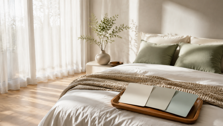
- Buy sample pots, not swatch cards. Paint a 12x12 inch patch directly on the wall in at least three spots: near the window, on the wall opposite the window, and in the darkest corner.
- Prime first. If you are painting over a dark color, the sample will be influenced by what is underneath. A coat of primer makes the test honest.
- Live with it for 3-4 days. Look at the patches at morning, noon, evening, and with your lamps on at night. The color will shift with the light, and you need to see all of those shifts.
- Check it against your bedding. Hold your actual duvet and pillowcase up against the sample. Your bedding is the largest textile in the room, and it will significantly influence how the wall color feels.
One thing I learned the hard way: when I first tried to choose a sage green for my own bedroom, I tested the swatch against a white wall with no furniture in the room. It looked perfect. After I moved the bed in and added a walnut dresser, the green took on an olive, almost brownish cast that I hated. The color had not changed - but the context had. The furniture's warm undertones were pulling the green warmer, and I had not accounted for that in my testing.
This is also where the "repaint in a year" mindset helps. If you are not sure about a color, do not commit to a full room. Paint one accent wall first, or use removable peel-and-stick wallpaper as a test. The cost of a sample pot and a weekend is nothing compared to the cost of repainting.
The Best Colors for Each Light Condition
Now that you have your filter, here is how to apply it. These are starting points, not prescriptions - your undertone audit and swatch testing will refine them.
North-Facing Rooms (Cool, Diffuse Light)
- Warm greige - a beige-gray hybrid with yellow undertones
- Soft cream - a warm off-white that will not read as gray
- Dusty terracotta - muted orange-brown that brings warmth
South-Facing Rooms (Bright, Warm Light)
- Dusty blue - a muted slate blue that will not wash out
- Sage green - a soft green that looks fresh in warm light
- Light gray - a cool gray that will look crisp, not cold
East-Facing Rooms (Morning Light, Neutral Afternoon)
- Warm white - a white with yellow or pink undertones
- Soft pink - a muted blush that glows in morning light
- Butter yellow - a pale, creamy yellow that energizes gently
West-Facing Rooms (Cool Morning, Golden Evening)
- Greige - balanced between warm and cool
- Muted lavender - a gray-purple that works in both light conditions
- Warm gray - a gray with brown undertones, not blue
Across all light conditions, the top 3 bedroom colors that consistently perform best for sleep are: dusty blue, sage green, and warm greige. These three are the safest bets because they are desaturated enough to not overstimulate, and they have enough flexibility to work with most undertones.
For a deeper dive on how wall color fits into the broader picture of your bedroom setup, see our guide on how to set up a sleep-friendly bedroom.
What Are the Top 10 Bedroom Colors for 2026?
If you are looking for trend-based direction, here is what is emerging for 2026. These are not just aesthetic picks - they are colors that align with the sleep science we covered above:
- Dusty blue - still the sleep champion, now trending in deeper, moodier shades
- Sage green - increasingly popular as biophilic design grows
- Warm greige - the versatile neutral that works everywhere
- Clay / terracotta - earthy warmth for north-facing rooms
- Muted lavender - a calm purple that is gaining traction
- Soft oatmeal - a warm off-white with yellow undertones
- Pale eucalyptus - a greener sage with cool undertones
- Charcoal blue - a deep, saturated blue for accent walls
- Warm sand - a beige with pink undertones that flatters most lighting
- Misty gray - a gray with green undertones, not blue
A common thread: 2026 is moving away from stark whites and cool grays. The trend is toward colors that feel grounded and natural - which, conveniently, also tend to be the colors that support sleep.
Colors to Avoid in the Bedroom
Some colors are worth avoiding not because they are ugly, but because they work against your sleep goals.
Bright red and orange. These are high-arousal colors. Your brain associates red with alertness and danger, which is the opposite of what you want at bedtime. The 2016 study in the Journal of Environmental Psychology found that red rooms increased physiological arousal compared to blue or green rooms. If you love red, use it in small accents - a throw pillow, a piece of art - not on the walls.
High-saturation purple. A bright, vivid purple can feel energetic and even slightly aggressive in large doses. Muted lavender is fine; electric purple is not.
Stark white. Pure white walls feel clinical and can cause glare, especially if you have a south-facing room. They also reflect more light, which can make it harder to wind down. If you want white, choose a warm off-white with yellow or pink undertones.
Black or very dark colors on all four walls. Dark colors absorb light and can make a room feel smaller and more enclosed. While some people find dark, cocooning rooms calming, for others it triggers feelings of anxiety. If you want the cocoon effect, use a dark accent wall behind the bed and keep the other walls lighter.
The general rule: avoid colors with high saturation and high brightness. What you want is a color with some gray mixed in - a "dusty" version of whatever hue you like.
Common Mistakes and Edge Cases
Here are the scenarios that trip people up, along with what I have learned from making them myself.
The no-window bedroom. If your bedroom has no windows (common in city apartments or converted basements), you have complete control over the light, which is actually an advantage. Use warm, mid-tone colors and invest in a good lamp with a warm bulb (2700K or lower). Your walls will not be fighting any natural light, so the color you see under your lamps is the color you get.
Rented spaces. If you cannot paint, use removable wallpaper on one accent wall, or focus on textiles - a colored duvet cover, curtains, and a large area rug can shift the room's color temperature without touching the walls. For a quick fix, check out our article on 5 bedroom tweaks for immediate sleep gains - several of them are color-related and rental-friendly.
Small bedrooms. Dark colors make a small room feel smaller. If your bedroom is under 100 square feet, stick to lighter, desaturated colors and use a darker accent wall behind the bed for depth.
The "everything matches" trap. You do not need your walls, bedding, and furniture to be the same color. In fact, too much of one color can be visually monotonous, which paradoxically makes it harder to relax because there is no visual "rest" for your eyes. Aim for a wall color that harmonizes with your undertones, not one that matches them exactly.
What if you just cannot decide? Start with the safest option - a warm greige or dusty blue - and live with it. The worst case is you repaint in 18 months. Paint is the most forgiving home improvement material; it is also the one that is hardest to get right without testing, which is why the 3-step filter exists.
The Bottom Line
Choosing a bedroom color for sleep is not about finding the "perfect" shade. It is about finding the color that works with your room's specific light, your furniture's undertones, and your personal response to color.
Here is the process in one breath: map your light, audit your undertones, test your swatches across a full day, and choose a desaturated version of a color you find calming. If you do that, you will land on a color that supports your sleep - not one that fights it.
And remember: the color is one piece of the sleep puzzle. Pair your paint choice with good sleep hygiene - consistent bedtime, cool room temperature, and a comfortable mattress - and you will see the full benefit. For a broader look at the sleep environment, our guide on creating a sleep-friendly bedroom setup covers the rest.